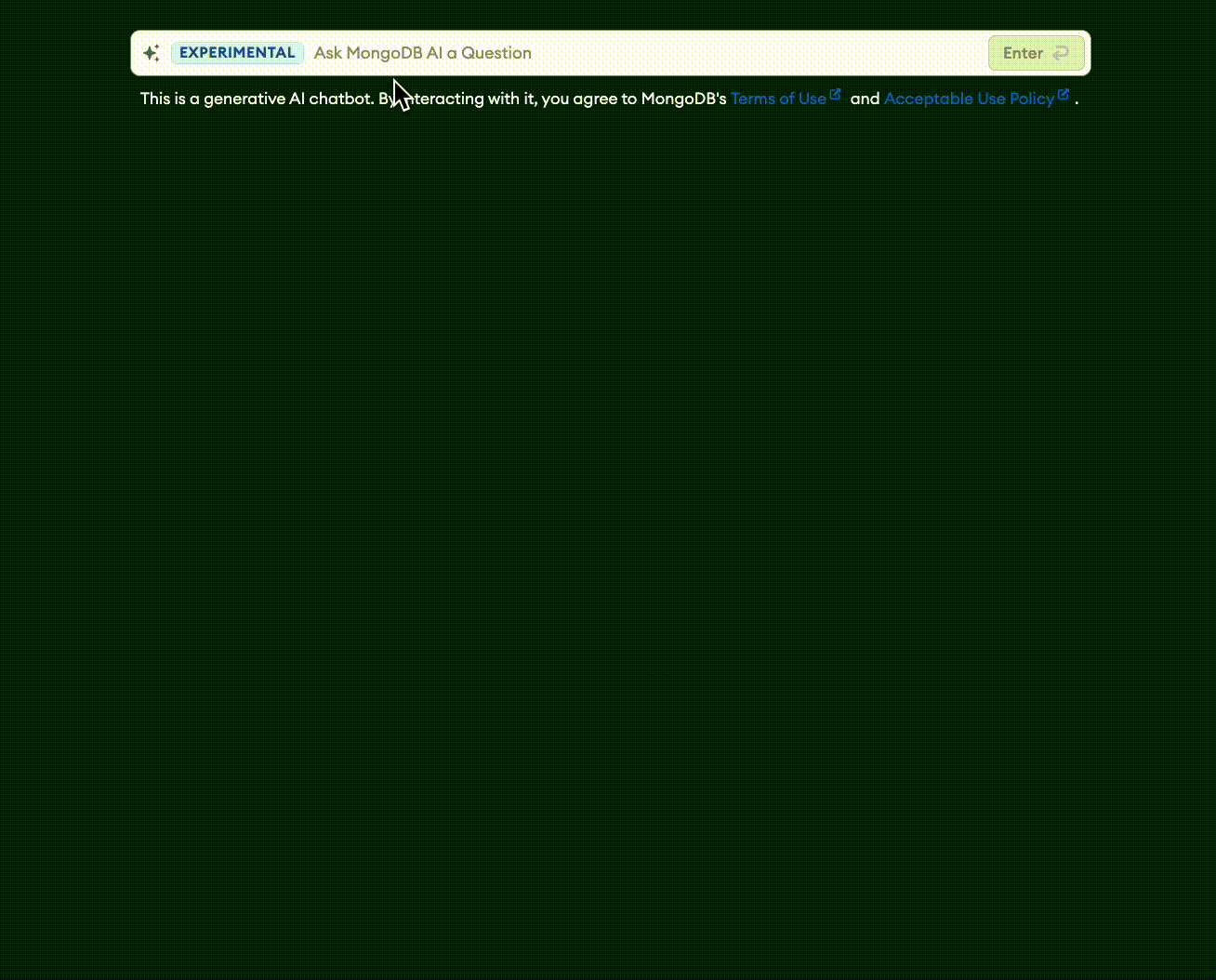
Chatbot UI
The MongoDB Chatbot UI is a React.js component library that you can use to build a chatbot UI.
Currently, it's focused on internal MongoDB use cases. However, we may make it more generic in the future if there is sufficient external interest.
Demo GIF
Install
Install the mongodb-chatbot-ui package from npm. This contains the React.js components that you can use to build a chatbot UI.
npm install mongodb-chatbot-ui
Usage
import Chatbot, {
  FloatingActionButtonTrigger,
  InputBarTrigger,
  ModalView,
  MongoDbLegalDisclosure,
  mongoDbVerifyInformationMessage,
} from "mongodb-chatbot-ui";

function MyApp() {
  const suggestedPrompts = [
    "How do I create a new MongoDB Atlas cluster?",
    "Can MongoDB store lists of data?",
    "How does vector search work?",
  ];
  return (
    <div>
      <Chatbot name="MongoDB AI" maxInputCharacters={300}>
        <InputBarTrigger
          bottomContent={<MongoDbLegalDisclosure />}
          suggestedPrompts={suggestedPrompts}
        />
        <FloatingActionButtonTrigger text="Ask My MongoDB AI" />
        <ModalView
          disclaimer={<MongoDbLegalDisclosure />}
          initialMessageText="Welcome to my MongoDB AI Assistant. What can I help you with?"
          initialMessageSuggestedPrompts={suggestedPrompts}
          inputBottomText={mongoDbVerifyInformationMessage}
        />
      </Chatbot>
    </div>
  );
}
Components
The mongodb-chatbot-ui package exports the following components.
Chatbot Root Component
The <Chatbot /> component is effectively a React context provider that wraps your chatbot. It accepts the following props:
| Prop | Type | Description | Default |
|---|---|---|---|
children | ReactElement | ReactElement[] | Trigger and View components for the chatbot, e.g. FloatingActionButtonTrigger and ModalView. | |
darkMode | boolean? | If true, the UI renders in dark mode. This overrides any theme darkMode setting. | The user's OS preference or theme value of darkMode. |
fetchOptions | ConversationFetchOptions? | If set, the provided options are included with every fetch request to the server. For more information on the available fetch options, refer to Supplying request options in the MDN documentation. | |
isExperimental | boolean? | If true, the UI includes EXPERIMENTAL badges throughout. | true |
maxCommentCharacters | number? | The maximum number of characters allowed in a user's comment on an assistant message. | 500 |
maxInputCharacters | number? | The maximum number of characters allowed in a user message. | 300 |
name | string? | The name of the chatbot. Used as the default in text throughout the UI. | If unspecified, the chatbot is anonymous. |
serverBaseUrl | string? | The base URL for the Chatbot API. | https://knowledge.mongodb.com/api/v1 |
shouldStream | boolean? | If true, responses are streamed with SSE. Otherwise the entire response is awaited. | If the browser supports SSE, true, else false. |
tck | string? | An analytics identifier to add to the end of all hyperlinks. | "docs_chatbot" |
user | { name: string; }? | An object with information about the current user (if there is one). | undefined |
ActionButtonTrigger
The <ActionButtonTrigger /> component opens a view component (like <ModalView />) when clicked. It accepts the following props:
| Prop | Type | Description | Default |
|---|---|---|---|
className | string? | A custom class name for the trigger container. Use this to apply custom css styles. | |
darkMode | boolean? | If true, this renders in dark mode. This overrides any theme or provider darkMode setting. | The user's OS preference or theme value of darkMode. |
text | string? | The text shown in the floating action button. | "MongoDB AI" |
FloatingActionButtonTrigger
The <FloatingActionButtonTrigger /> component opens a view component (like <ModalView />) when clicked. It accepts the same props as ActionButtonTrigger but also includes a default position: fixed style that makes the button float in the bottom right of the window on top of the content (z-index: 100).
InputBarTrigger
The <InputBarTrigger /> component opens a view component (like <ModalView />) when the user sends their first message. It accepts the following props:
| Prop | Type | Description | Default |
|---|---|---|---|
bottomContent | ReactNode? | Content that appears immediately below the input bar, e.g. for a terms of use disclaimer. | If not specified, no content is shown. |
className | string? | A custom class name for the trigger container. Use this to apply custom css styles. | |
darkMode | boolean? | If true, this renders in dark mode. This overrides any theme or provider darkMode setting. | The user's OS preference or theme value of darkMode. |
fatalErrorMessage | string? | A custom error message shown in the input bar when an unrecoverable error has occurred. | "Something went wrong. Try reloading the page and starting a new conversation." |
suggestedPrompts | string[]? | A list of suggested prompts that appear in the input bar dropdown menu. | If no prompts are specified, the dropdown is not shown. |
placeholder | string? | The placeholder text shown when the input bar is empty. | If not specified, the input bar uses default placeholders. |
ModalView
The <ModalView /> component renders a chat message feed in a modal window. It accepts the following props:
| Prop | Type | Description | Default |
|---|---|---|---|
className | string? | A custom class name for the view container. Use this to apply custom css styles. | |
darkMode | boolean? | If true, this renders in dark mode. This overrides any theme or provider darkMode setting. | The user's OS preference or theme value of darkMode. |
disclaimer | ReactNode? | A disclaimer message shown at the top of the message feed. Can include terms of service, etc. | If not specified, no disclaimer is shown. |
disclaimerHeading | string? | A custom heading for the disclaimer at the top of the message feed. | "Terms of Use" |
fatalErrorMessage | string? | A custom error message shown in the input bar when an unrecoverable error has occurred. | "Something went wrong. Try reloading the page and starting a new conversation." |
initialMessageSuggestedPrompts | string[]? | A list of suggested prompts that appear alongside the initial assistant message. | If no prompts are specified, then no prompts are shown. |
initialMessageText | string? | The text content of an initial assistant message at the top of the message feed. | If no text is specified, then no message is shown. |
inputBarPlaceholder | string? | The placeholder text shown when the input bar is empty. | If not specified, the input bar uses default placeholders. |
inputBottomText | string? | Text that appears immediately below the input bar. | If not specified, no bottom text is shown. |
windowTitle | string? | The text shown at the top of the chat window. | If not specified, this is the Chatbot.name. If that's undefined the window has no title. |